
Speedinvest
Client: Speedinvest
Year: 2019
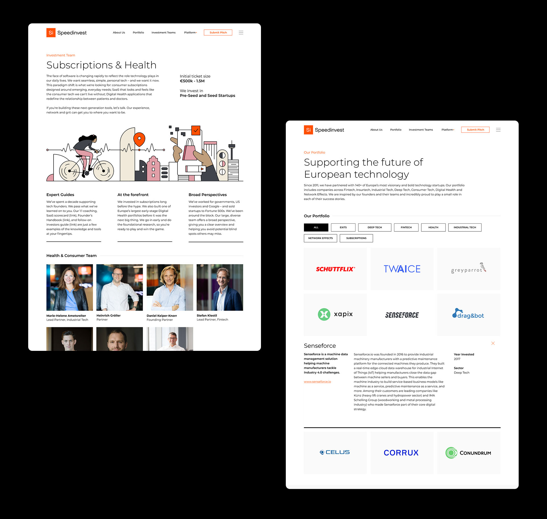
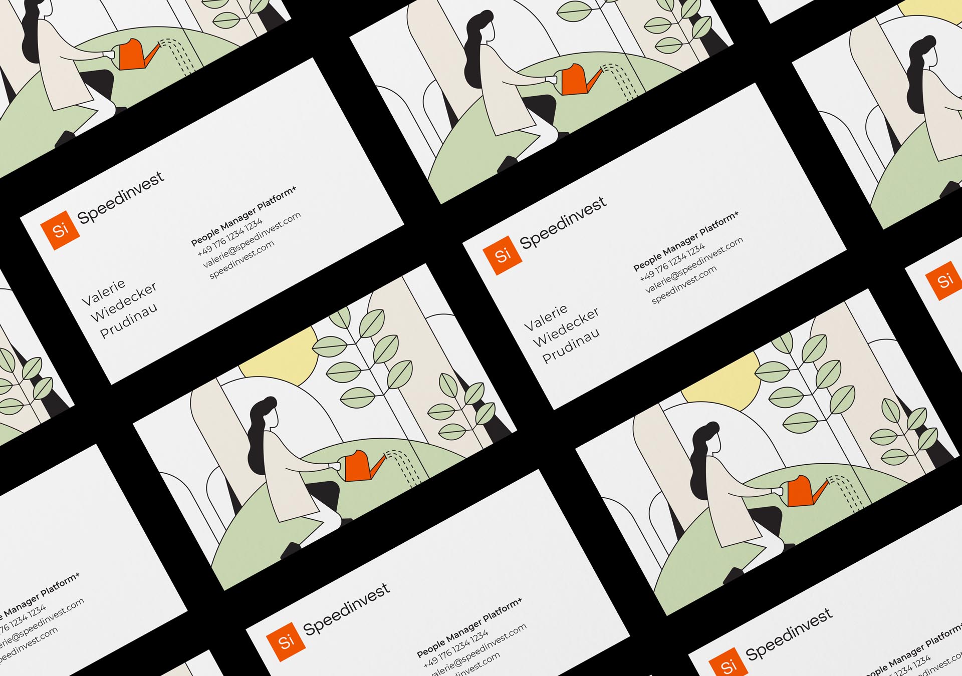
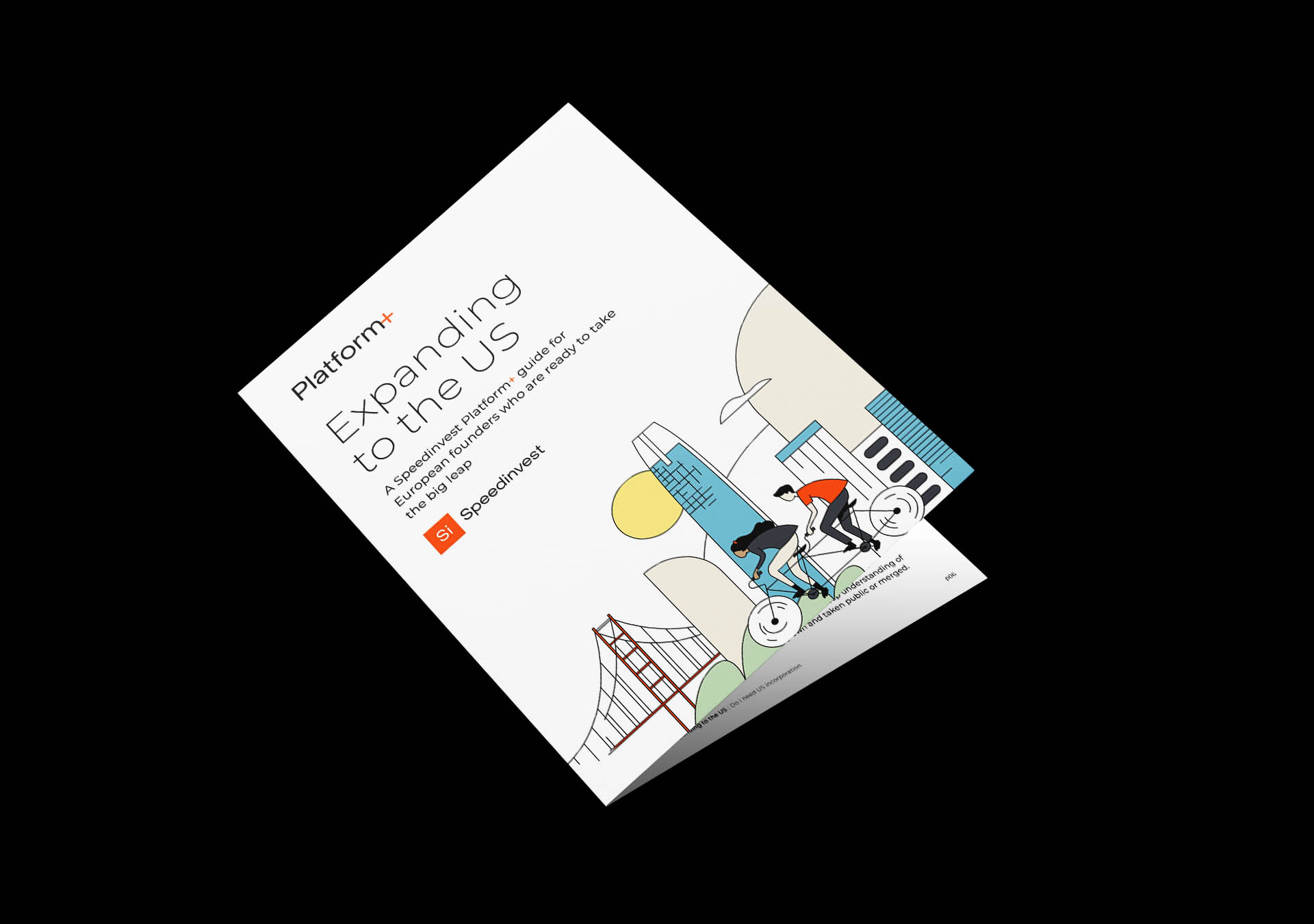
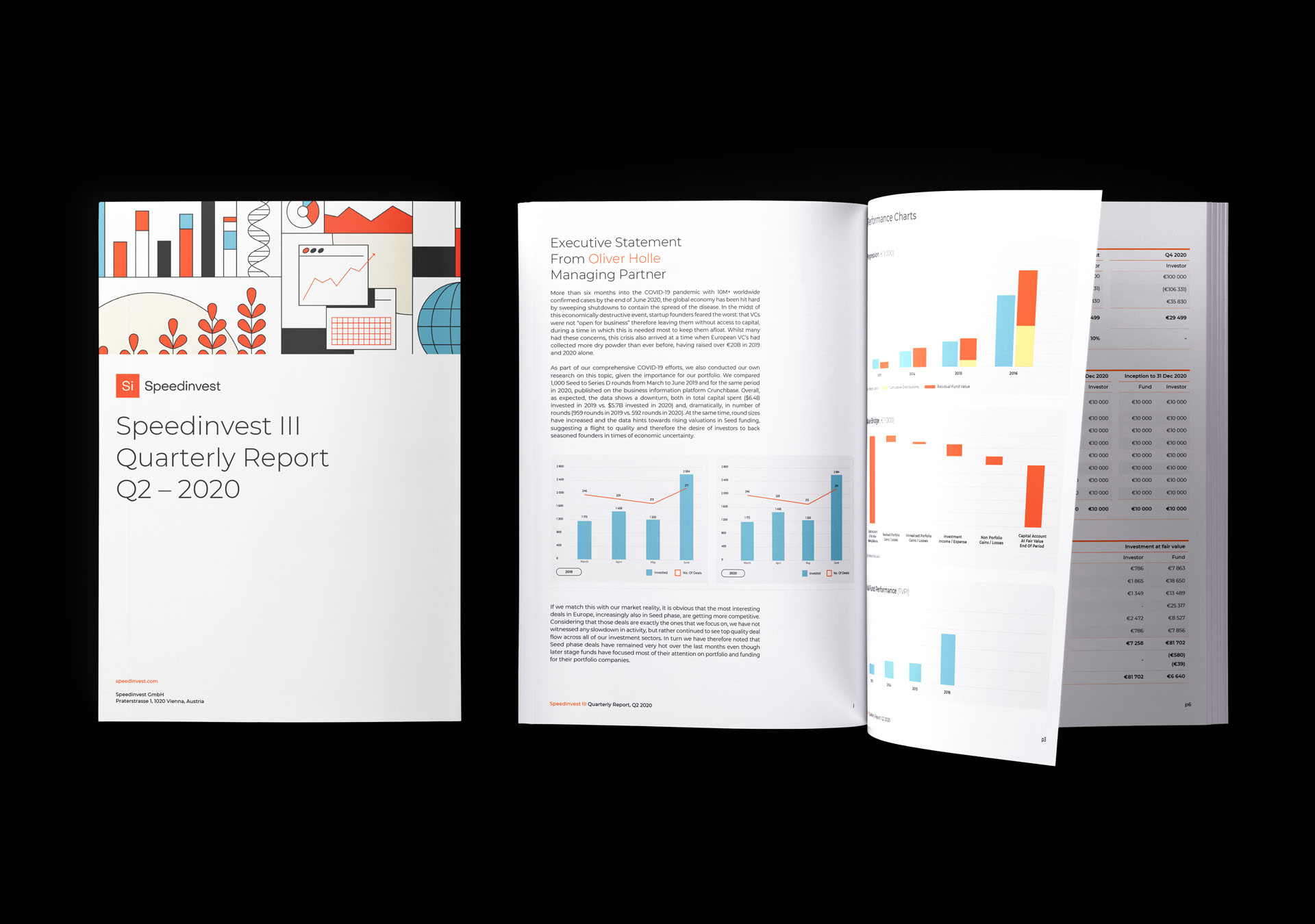
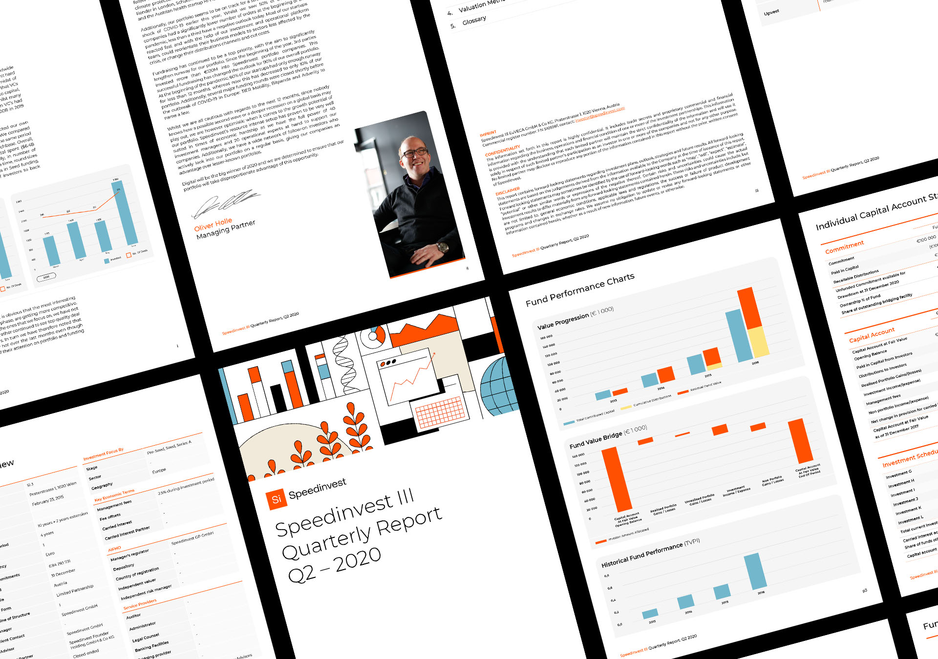
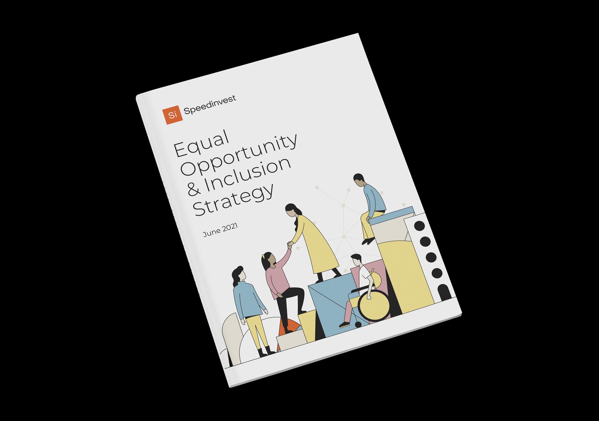
A comprehensive brand identity refresh, website design and development, and communications and design work for a European VC with a founder-first approach. Speedinvest is a venture capital fund with more than €400m to invest in pre-seed, seed, and early-stage tech startups across Europe. With a rock solid reputation in the VC game, and an appetite to grow Speedinvest's portfolio and fund aggressively, the VC firm needed an identity to communicate their future facing ambitions. The legacy Speedinvest identity invoked a periodic table of elements, which felt dated and static after many years representing the brand. Embracing a principle of evolution, not revolution, the new identity leverages existing brand equity and connotations of stability and confidence held in the orange square device, but breathes fresh air into the identity as a whole, with a modern typographic system, vibrant illustrations, and plenty of negative space.


"Si’s creativity, strategic thinking, and dedication to high-quality collateral across all mediums have been instrumental in ensuring Speedinvest is well-positioned in the very competitive world of venture capital."
