Design Indaba 25
Client: Intearctive Africa
Year: 2020
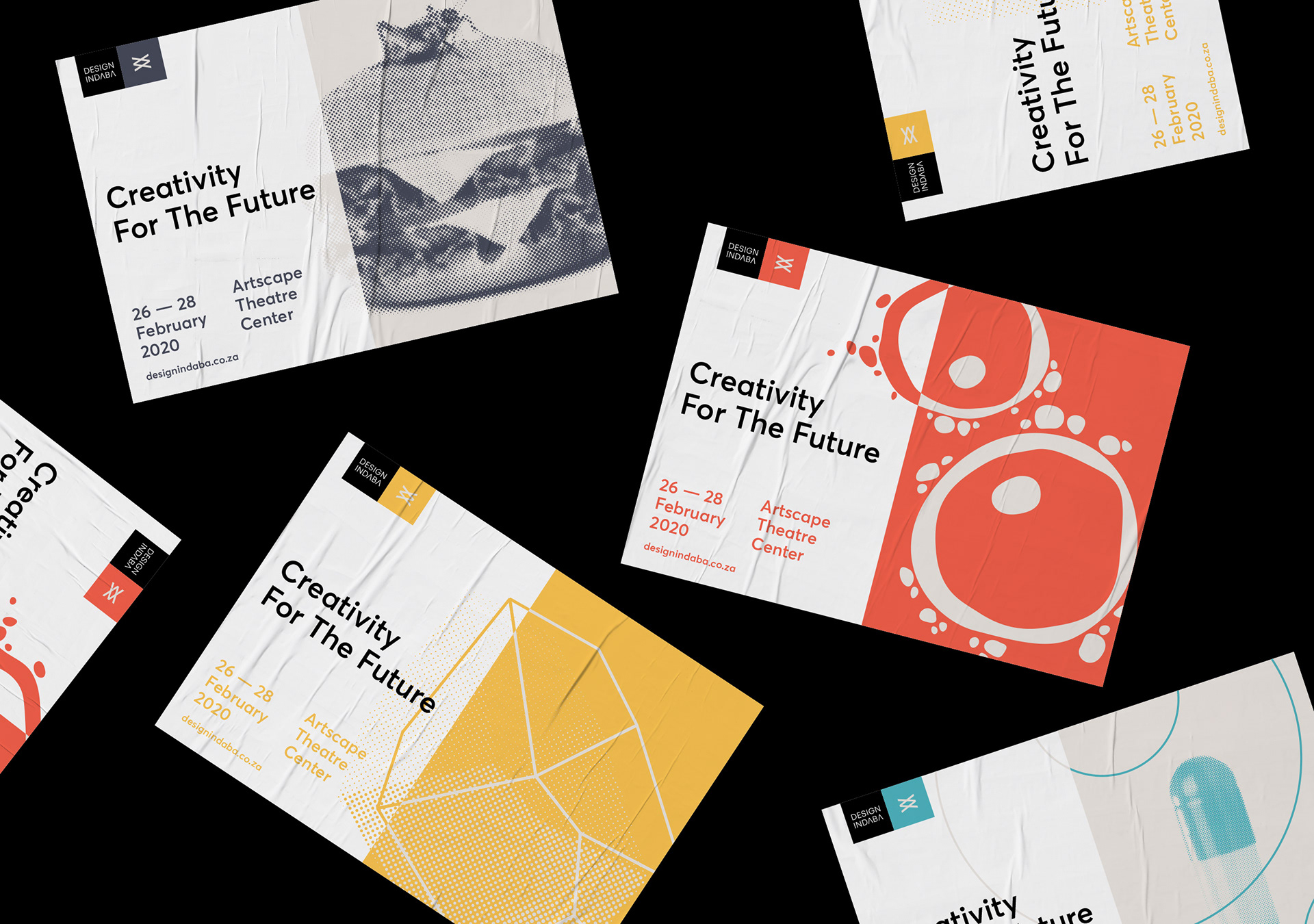
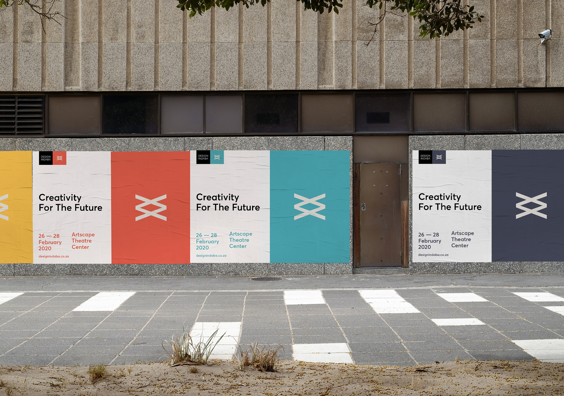
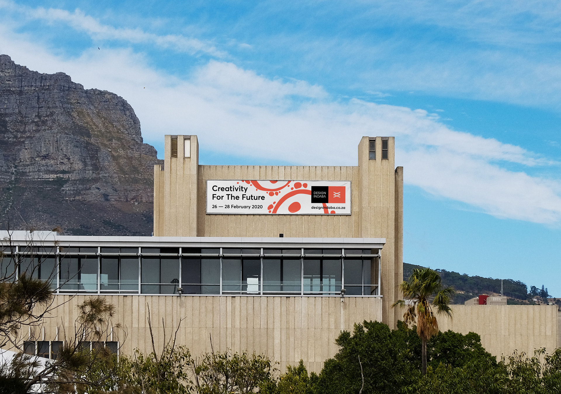
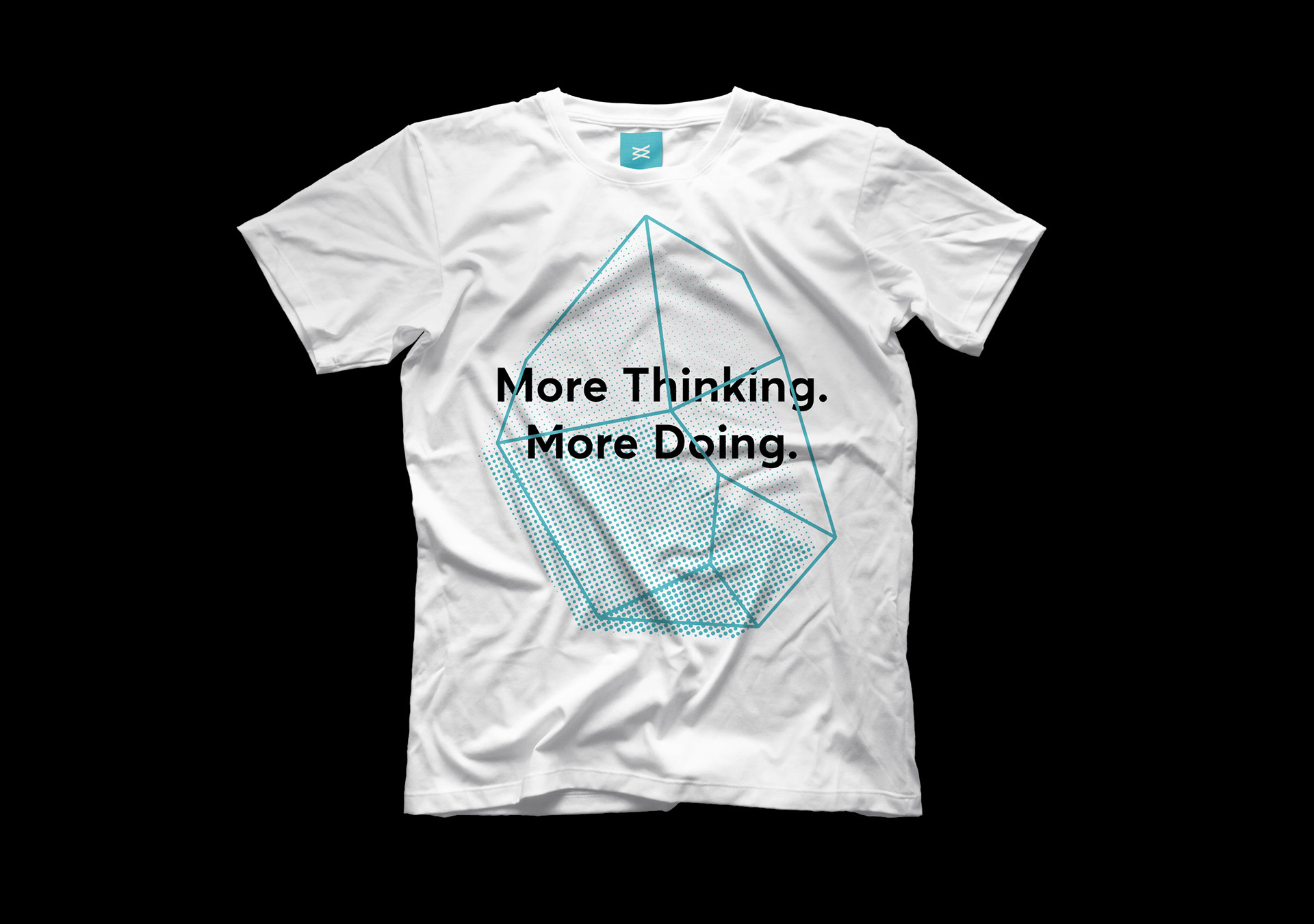
Branding, campaign art direction and festival packaging to the 25th anniversary of the Design Indaba conference, happening in 2020 at the Artscape Theatre in Cape Town. For the festival's Silver Jubilee, the brief was to look to the future of design and creativity instead of leaning on the festivals illustrious past in a retrospective campaign. The branding had to preserve the Design Indaba identity, while introducing art direction that felt celebratory, in keeping with the auspicious occasion.

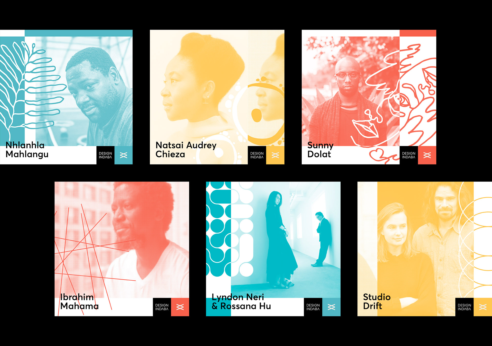
The logo design for the 25th anniversary signified the date (two stacked roman numeral X's representing '20) and the edition (two roman numeral V's multiplied across each other to represent 25). A bright and distinctive colour palette was selected to bring energy and character to the existing identity, while imbuing the design with a distinctly African aesthetic.

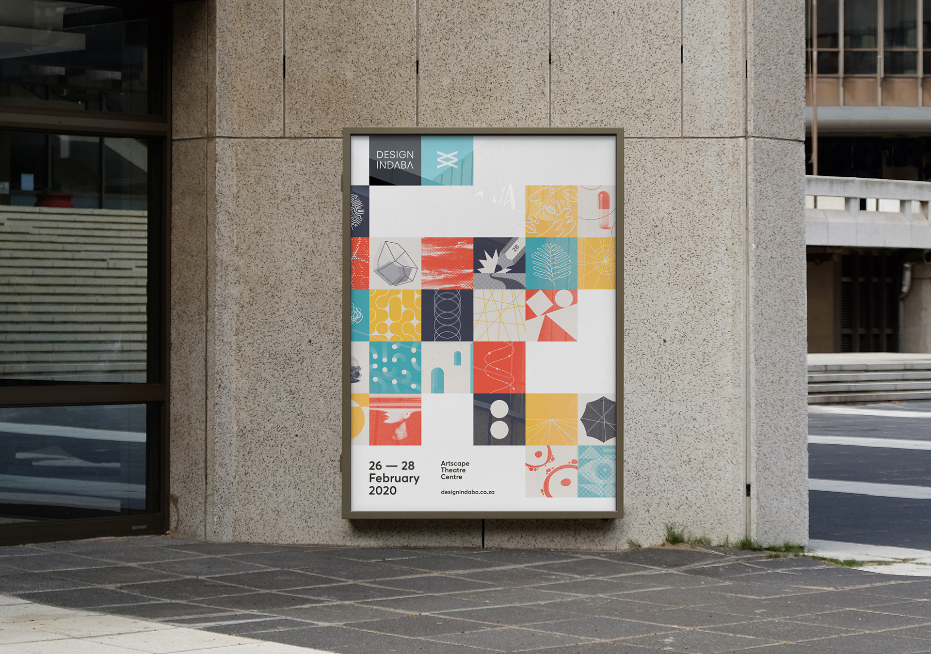
In collaboration with the Design Indaba team, I defined 25 themes that would impact the future of design. Each theme is translated as a motif to form a modular set, that can be used in pattern, layout or in isolation as abstracts breaking free of their square holding devices. The intention was to create a visual asset pack with enough versatility to serve the wide variety of subjects and speakers, as well as the exhaustive festival collateral rollout without becoming stale or repetitive.

Campaign Elements