
Bio Protocol
Client: Bio Protocol
Year: 2022 - Present
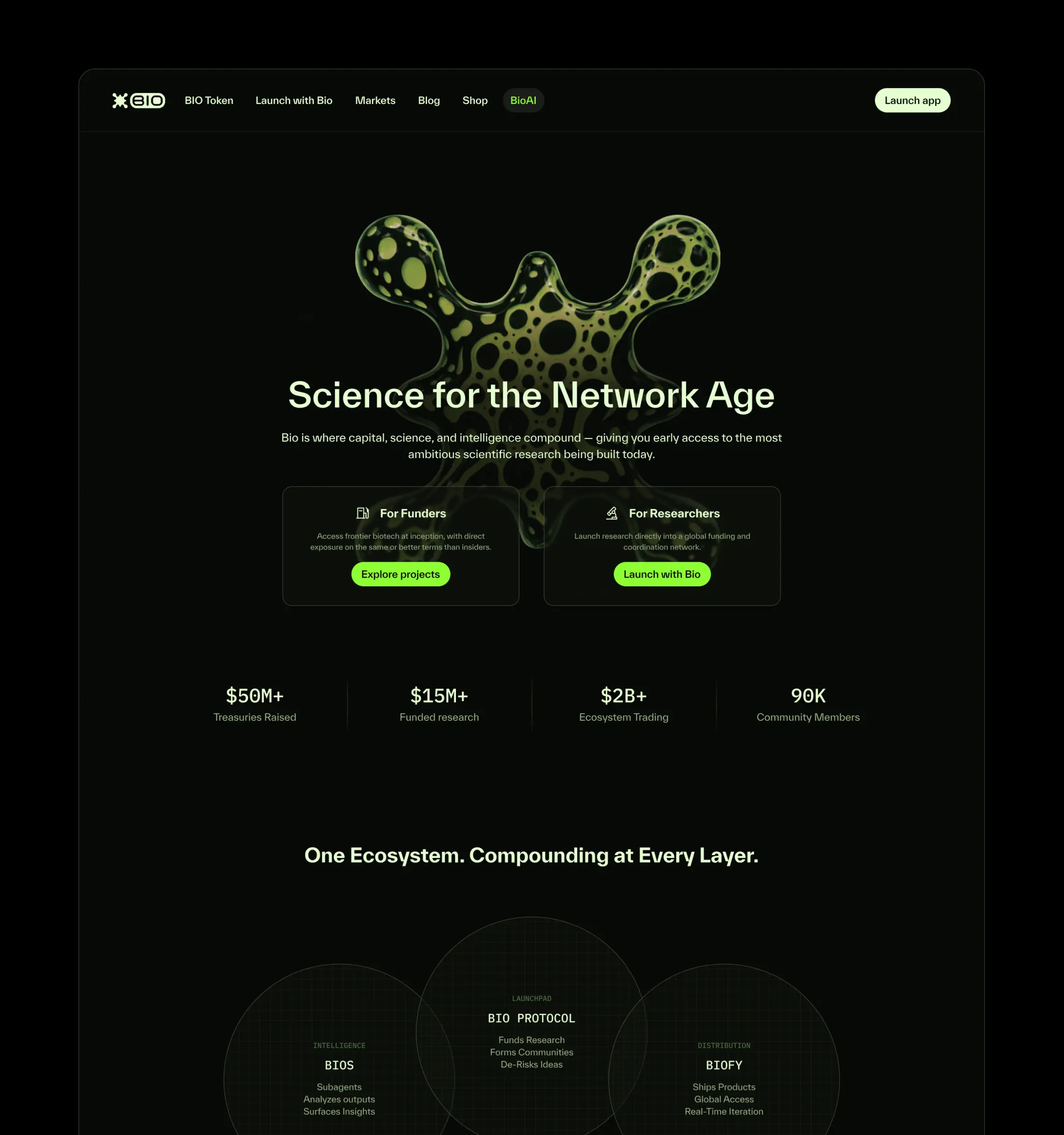
Bio Protocol is a decentralized network accelerating biotech innovation through blockchain infrastructure, AI, and community-driven funding. The protocol enables researchers, builders, and global communities to coordinate around the development, funding, and commercialization of breakthrough science, creating new pathways for how biomedical research is discovered, financed, and brought into the world.
The work represented here captures only a small fragment of a much larger, multi-year creative contribution to the Bio ecosystem. As a core contributor and Head of Brand for the project, my role spanned strategic positioning, visual identity development, ecosystem storytelling, product marketing, web design, campaign systems, creative direction, and ongoing stewardship of the Bio brand across a rapidly evolving network of products, protocols, and communities.
This project presented a rare opportunity to define not only a singular brand, but an entire ecosystem of spinouts, sub-projects, and emerging initiatives operating under a shared cultural and visual framework. The work developed for the Bio Protocol brand established a design and communication language for an entirely new category emerging at the intersection of biotechnology and blockchain.
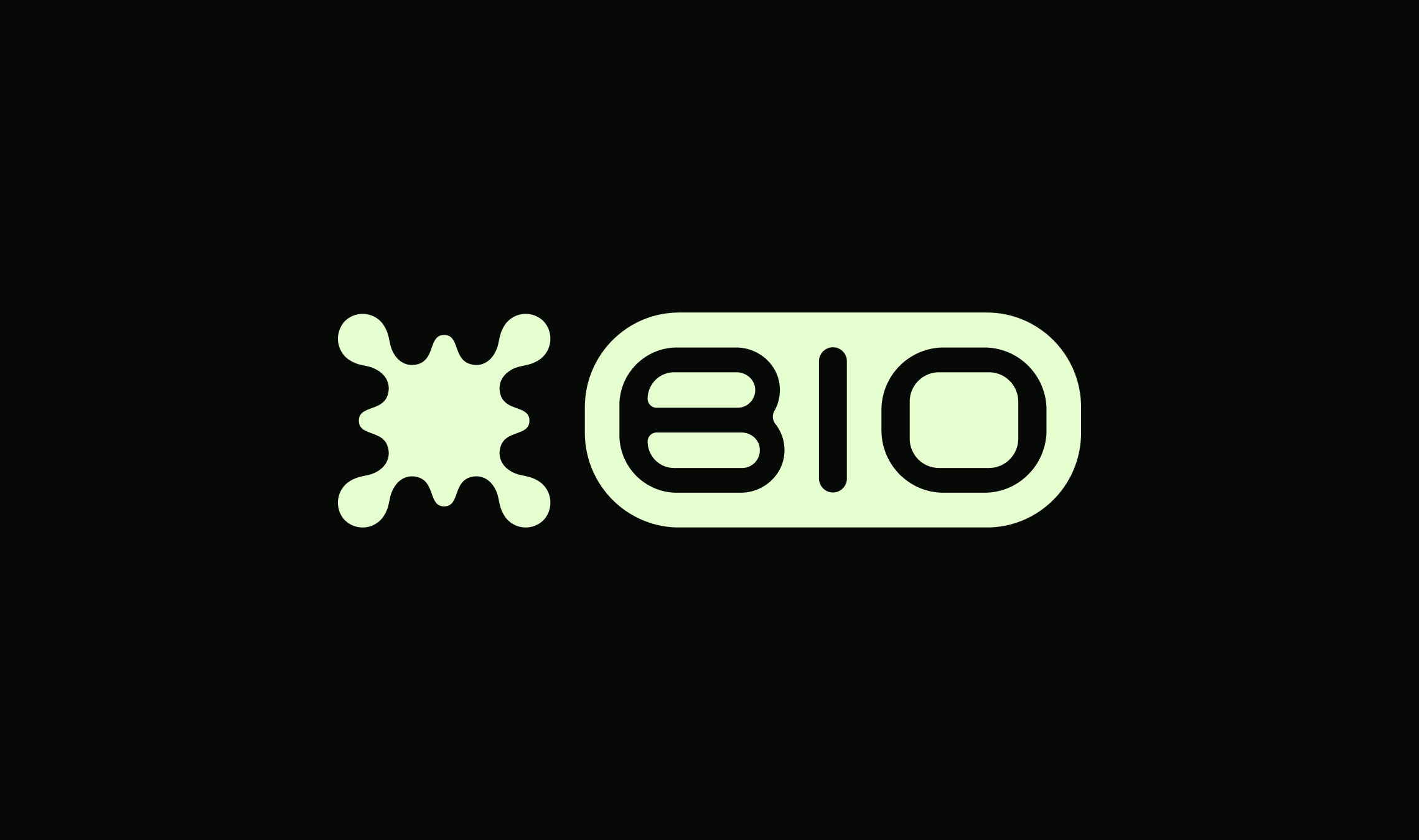
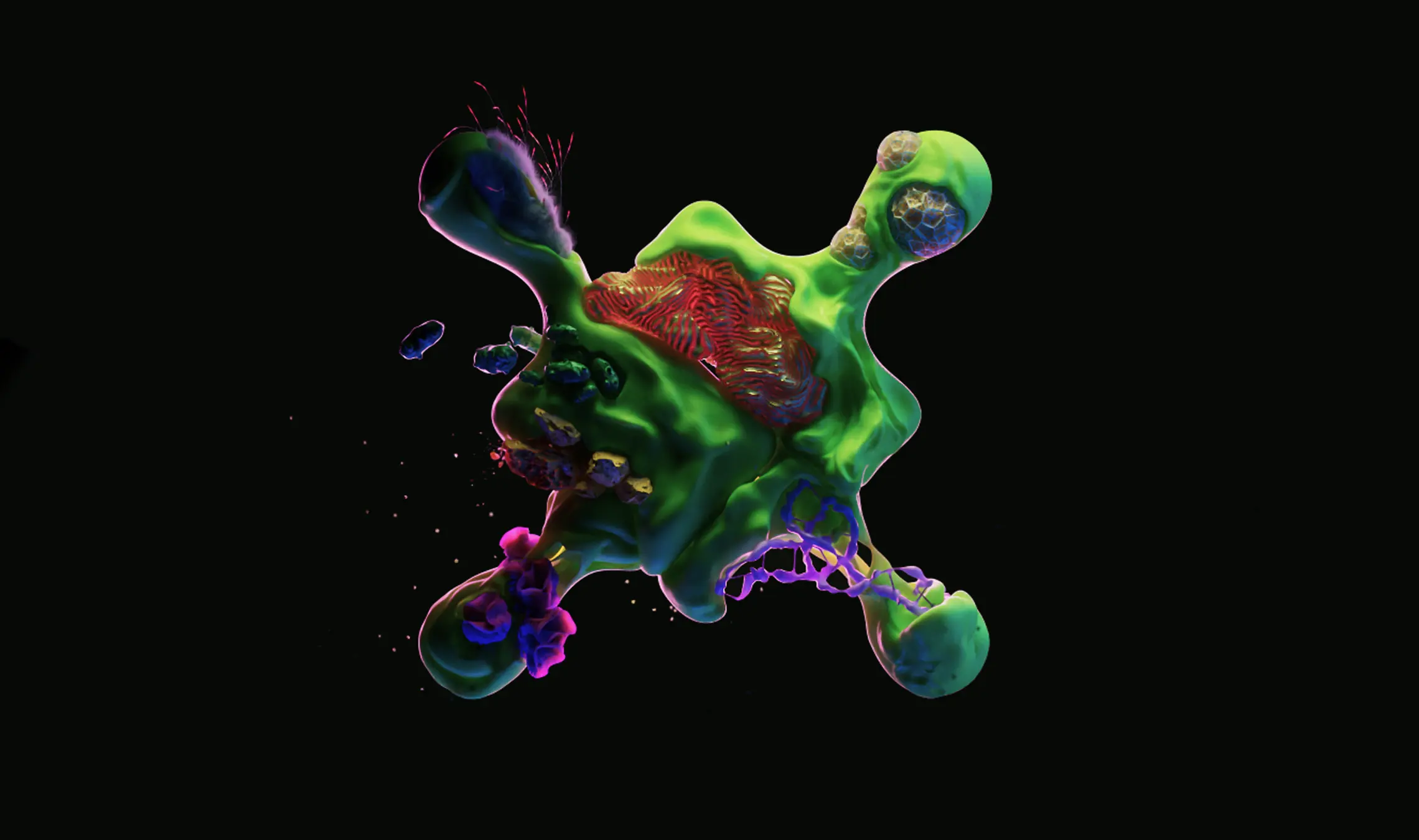
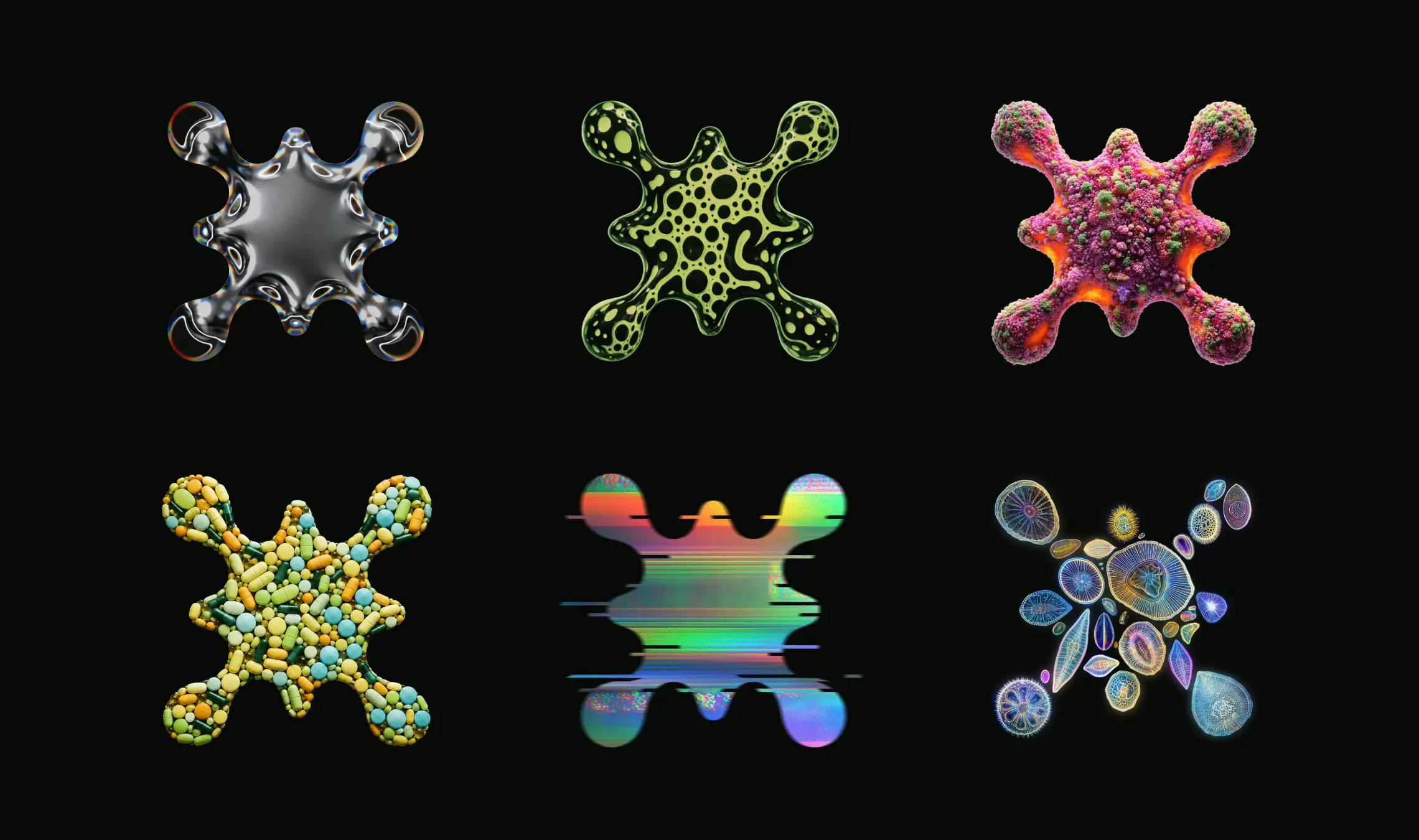
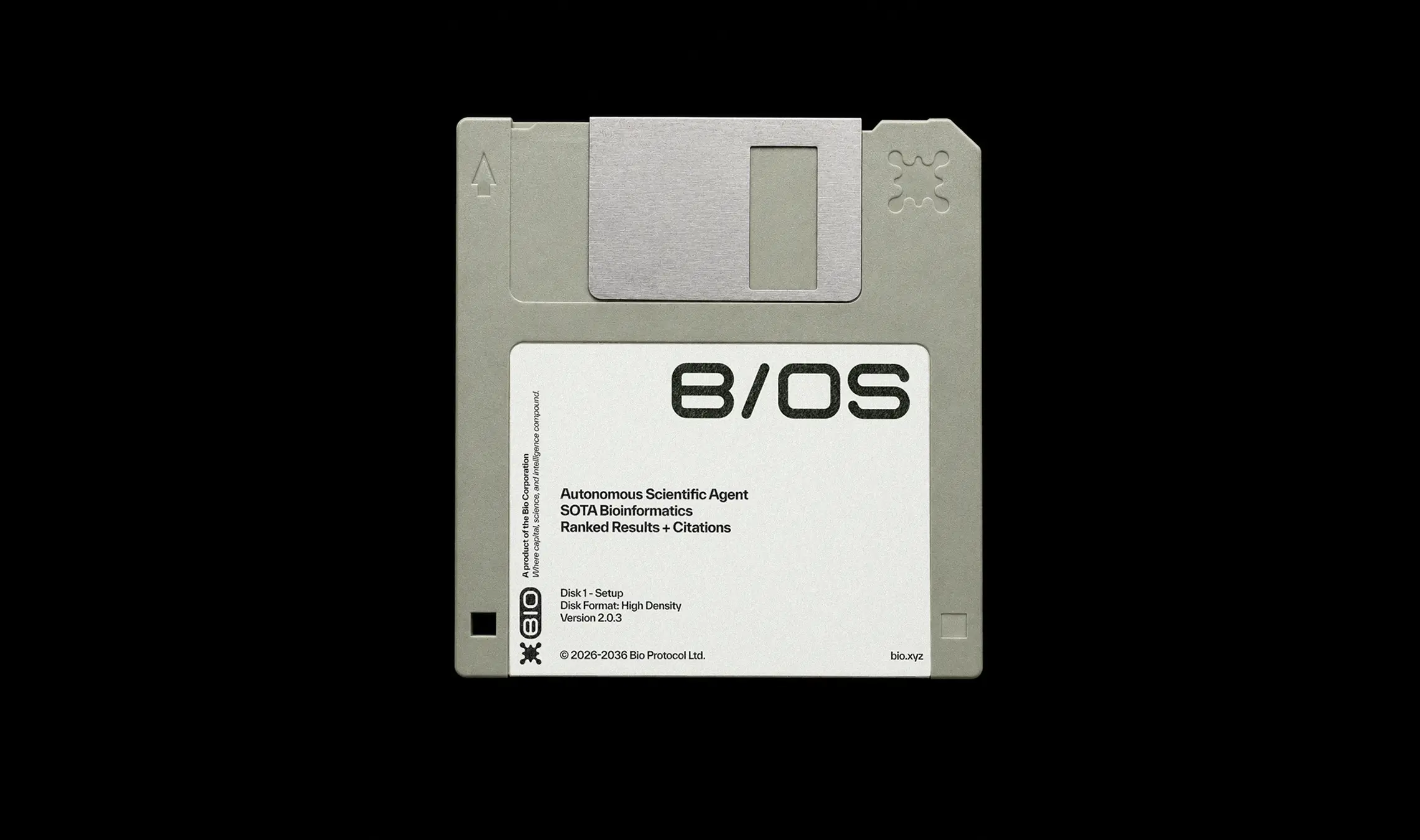
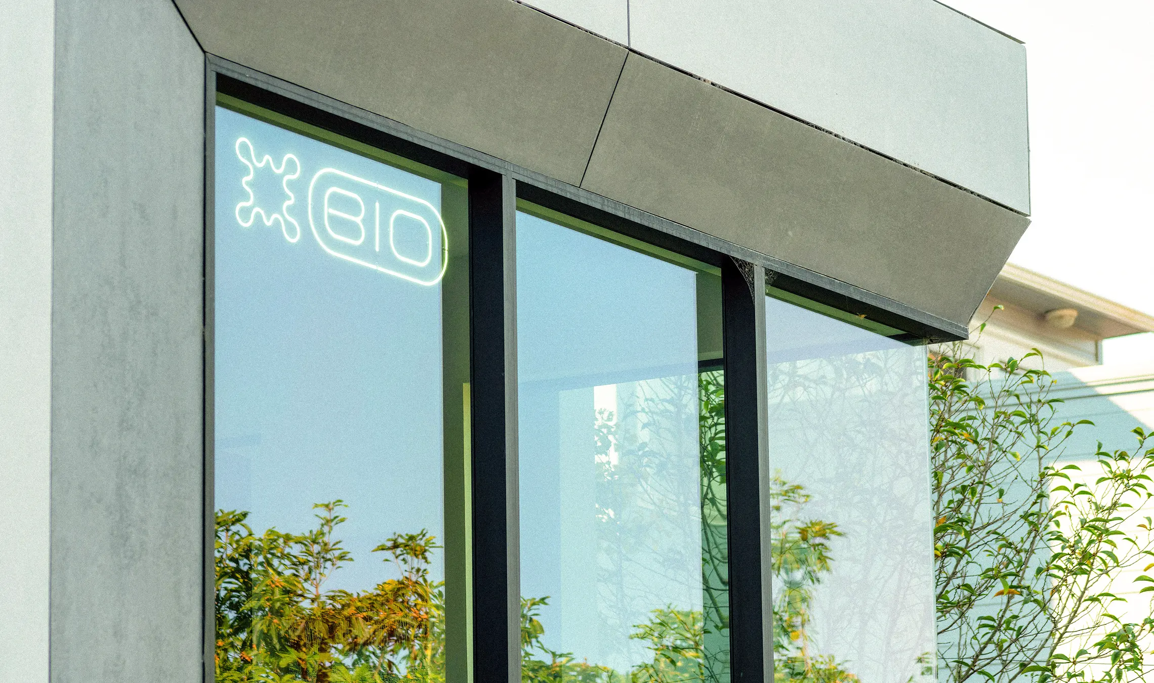
The Bio Logo
The Bio logo combines an organic splash form with deliberate symmetry, symbolizing the pursuit of order within the inherent complexity of the life sciences. Inspired by Rorschach inkblots and the fluid, magnetic behavior of ferrofluids, the mark balances unpredictability with structure — reflecting Bio’s role in helping codify, coordinate, and accelerate scientific discovery. The symbol is paired with a bespoke typeface, creating a visual language that feels both technical and biological.
As the ecosystem continues to expand, the logo is frequently reinterpreted through new materials, mediums, and visual treatments, allowing the identity to adapt fluidly across vastly different products, technologies, and cultural touchpoints while remaining unmistakably Bio.
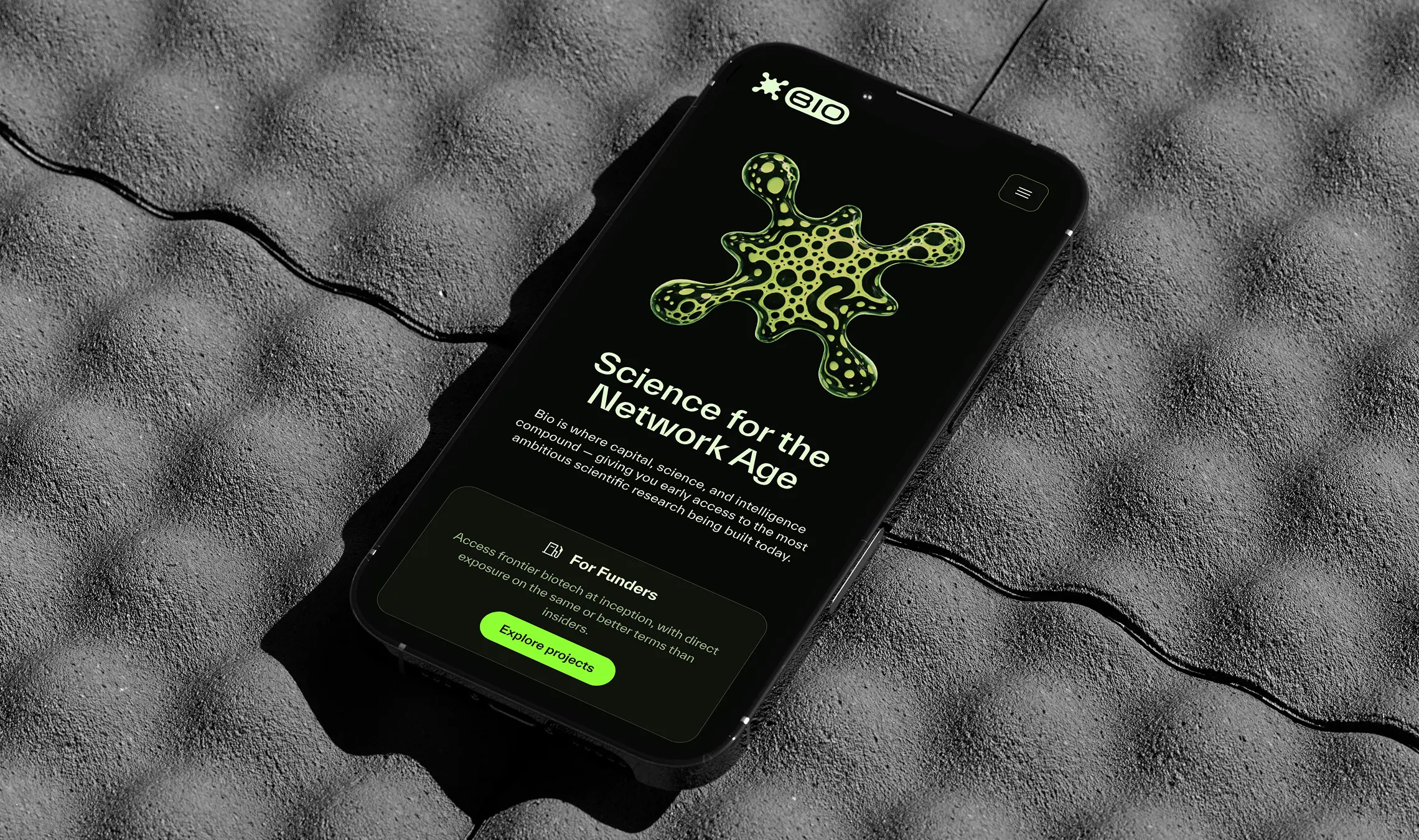
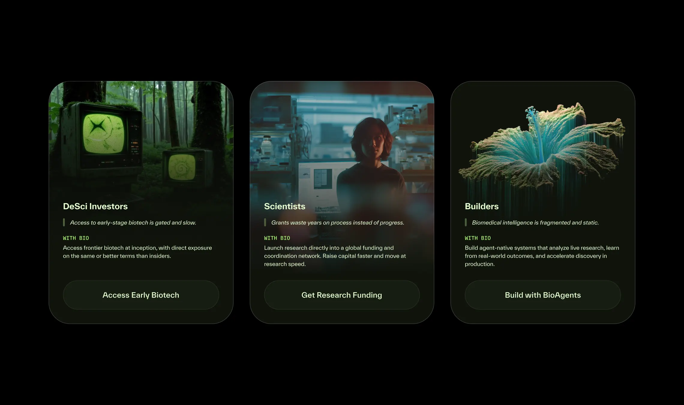
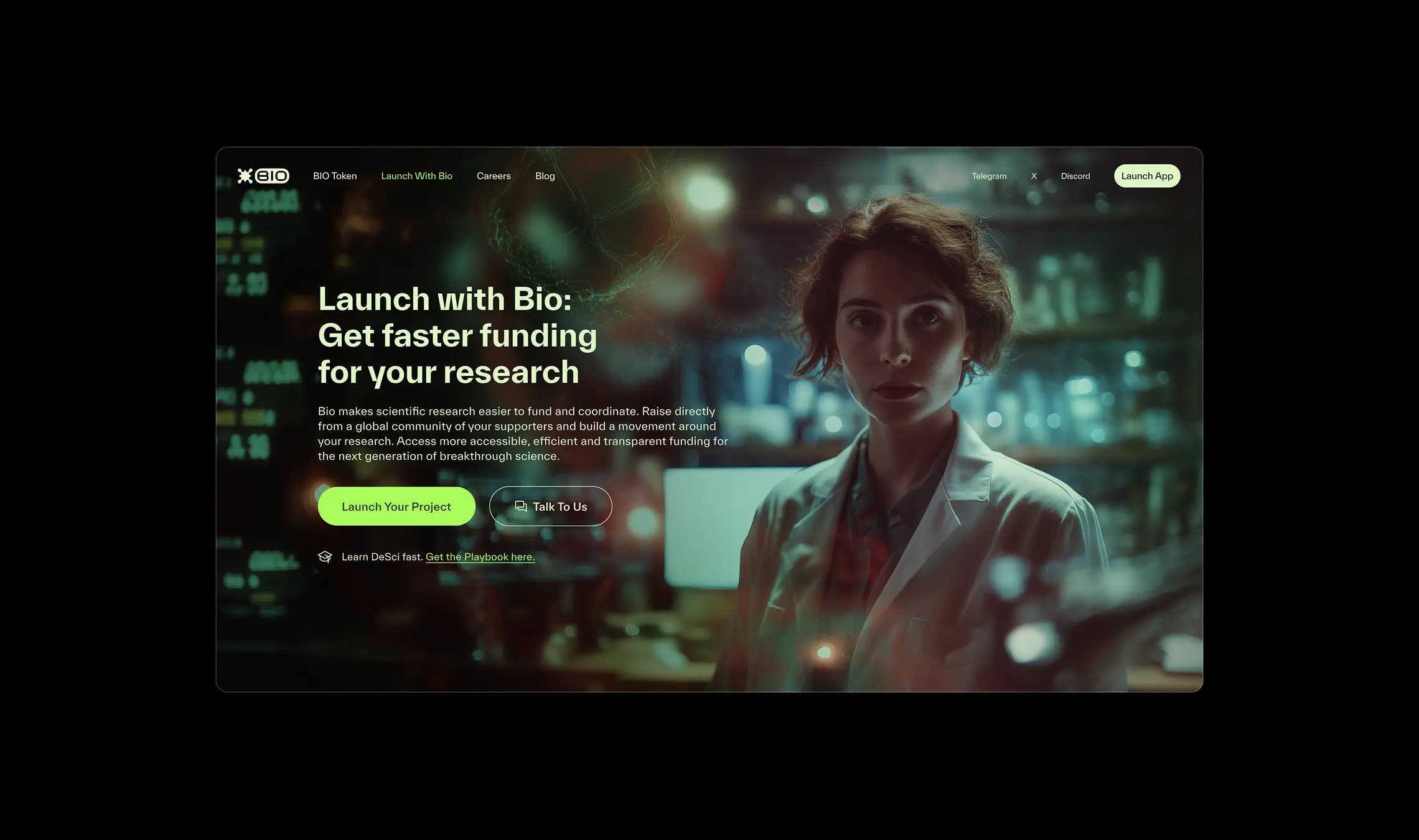
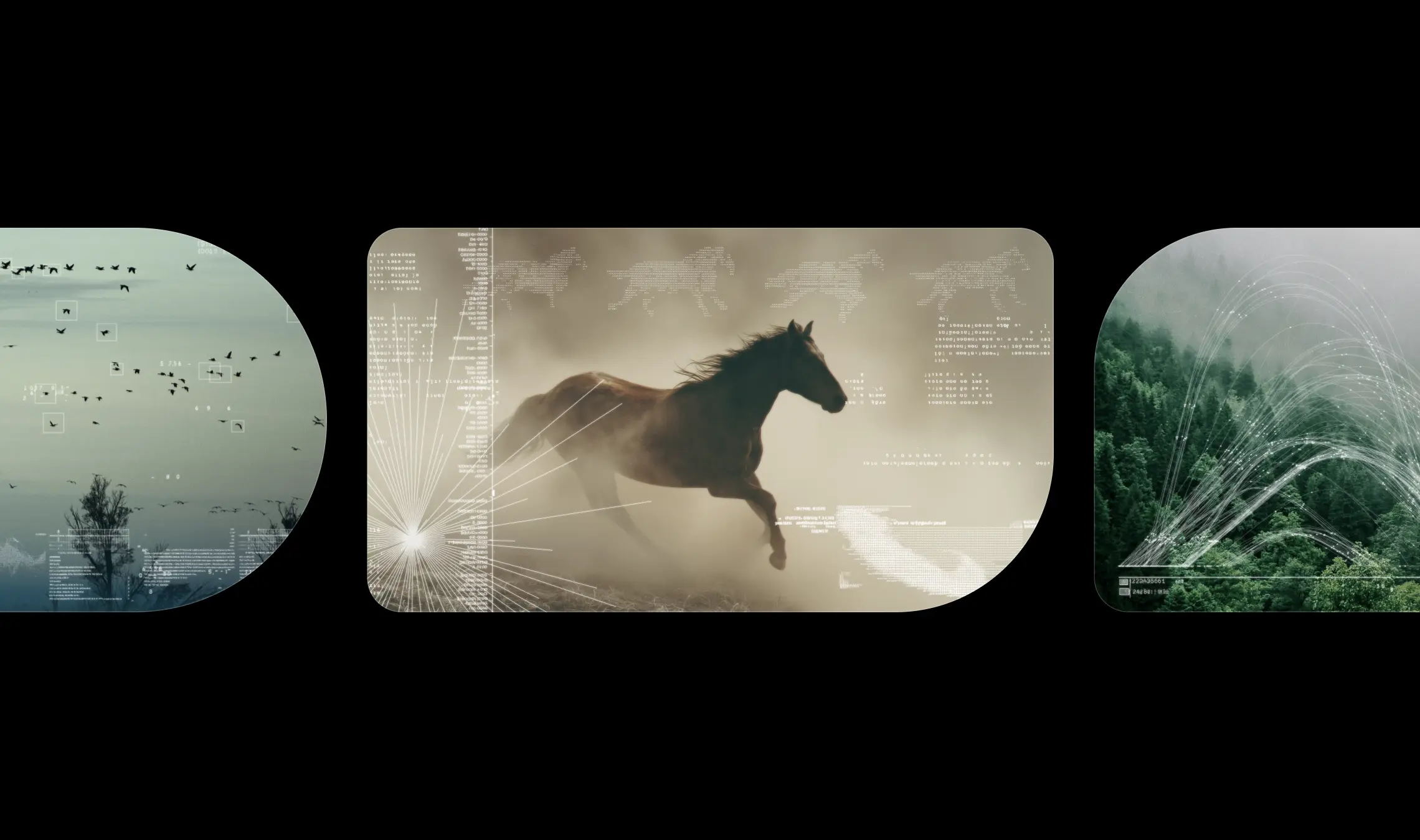
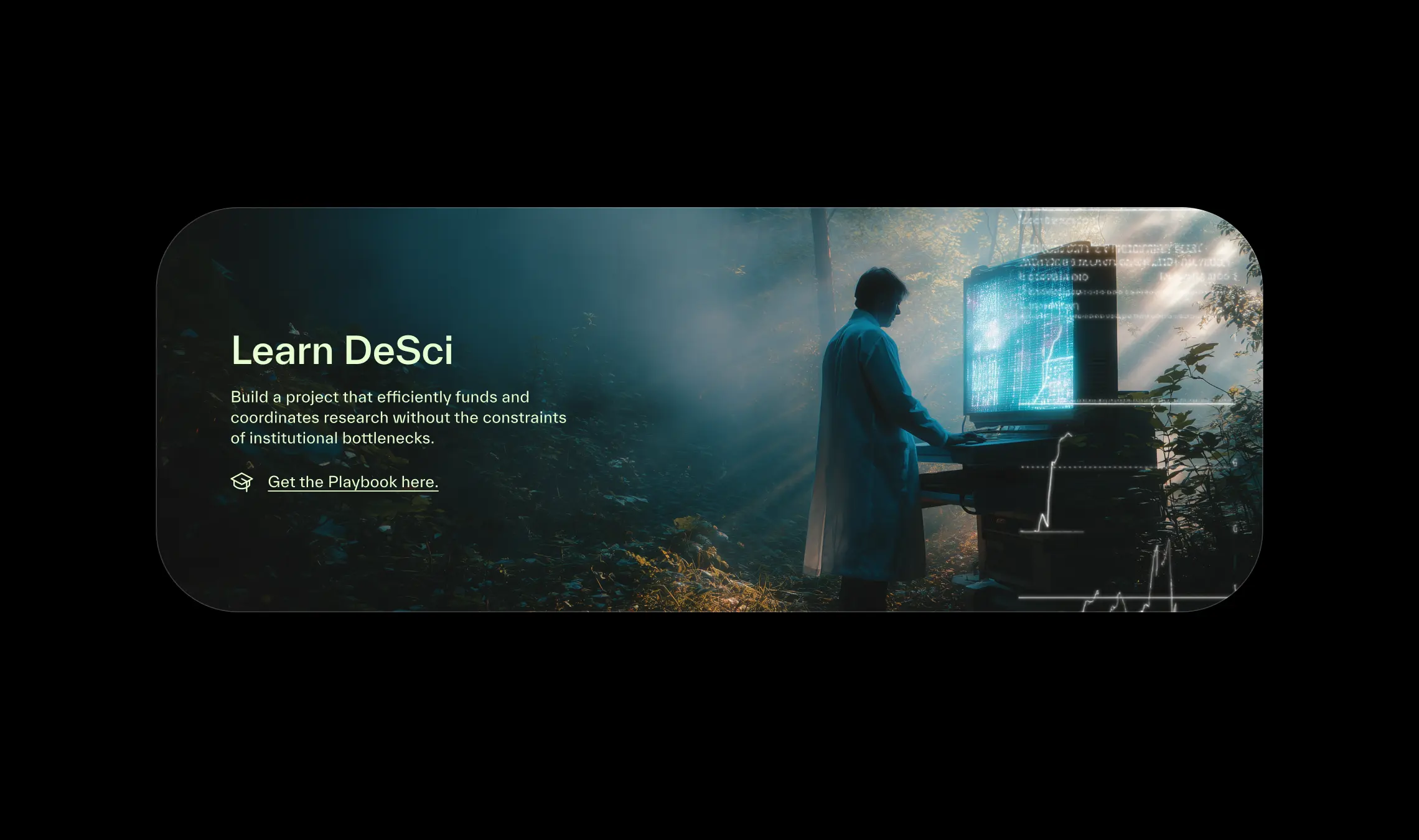
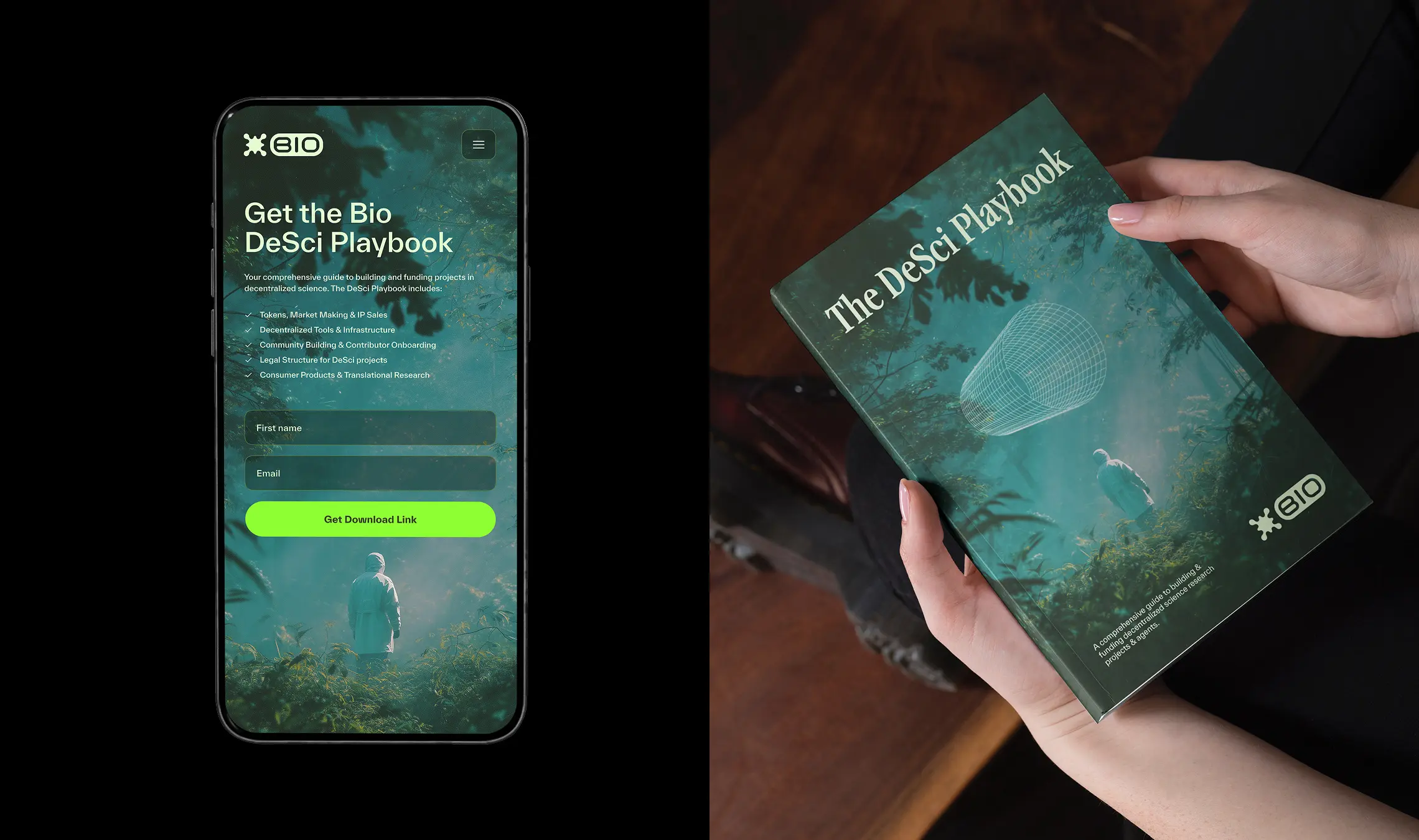
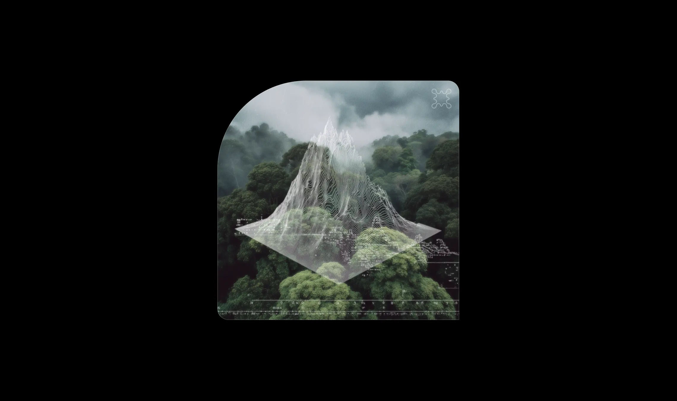
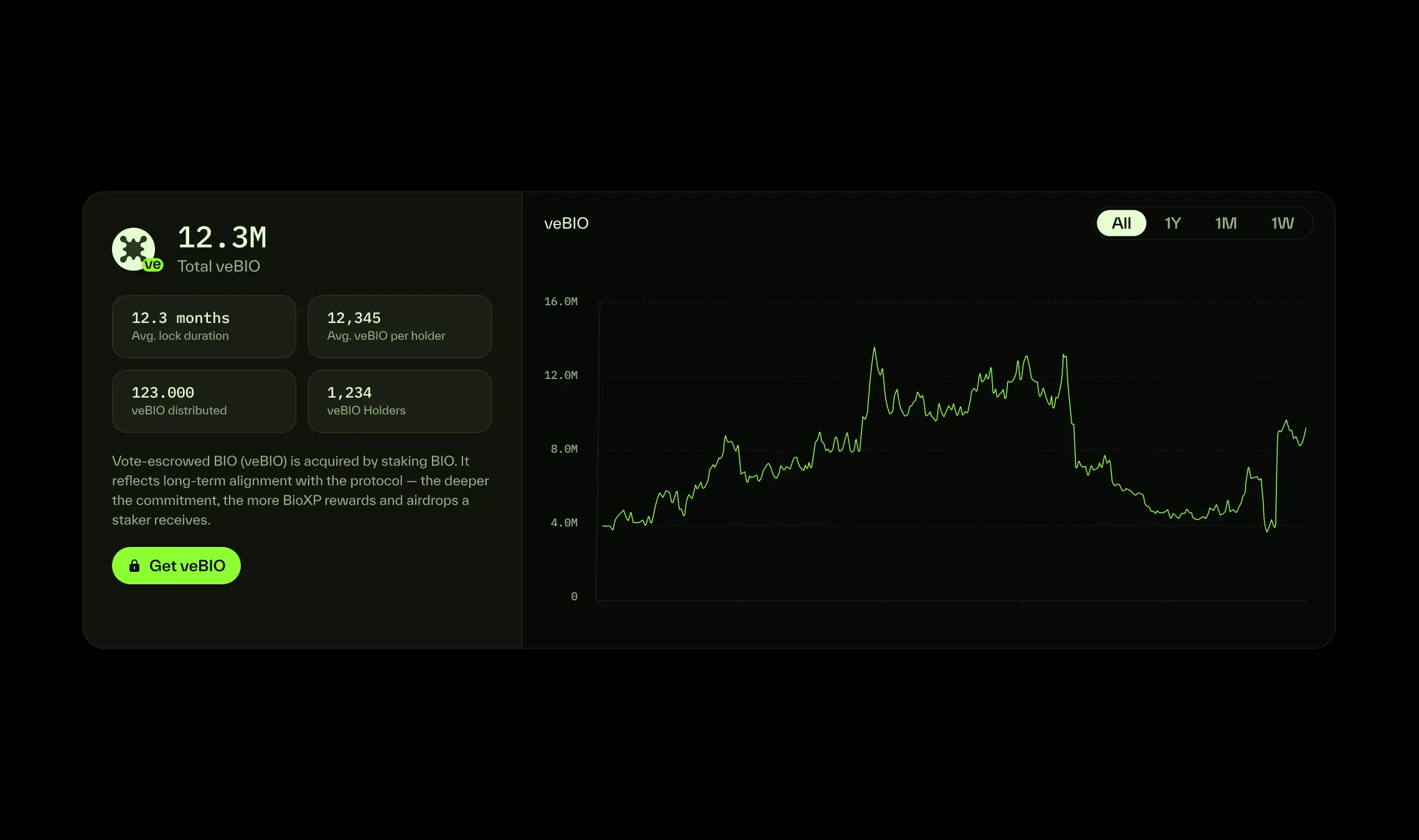
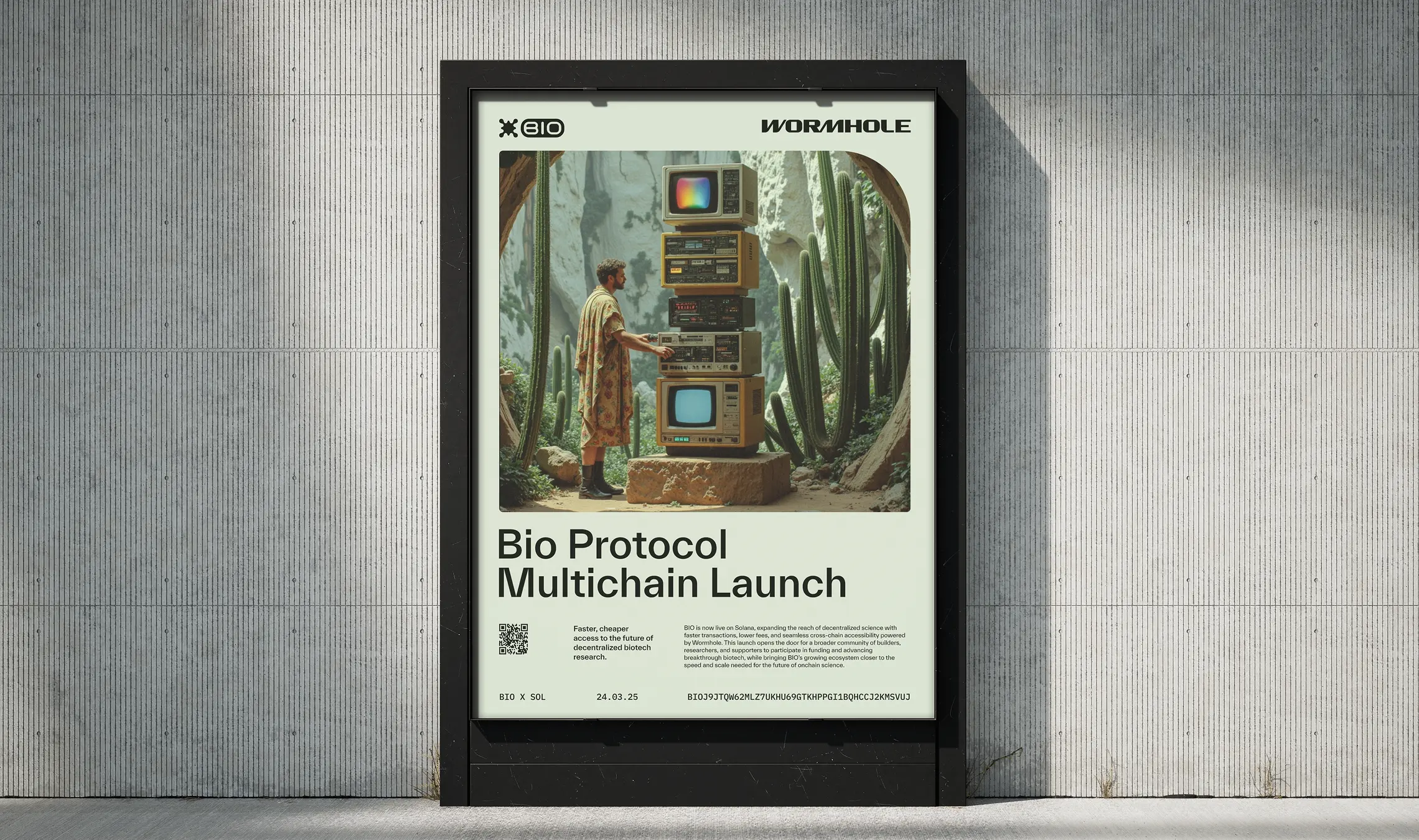
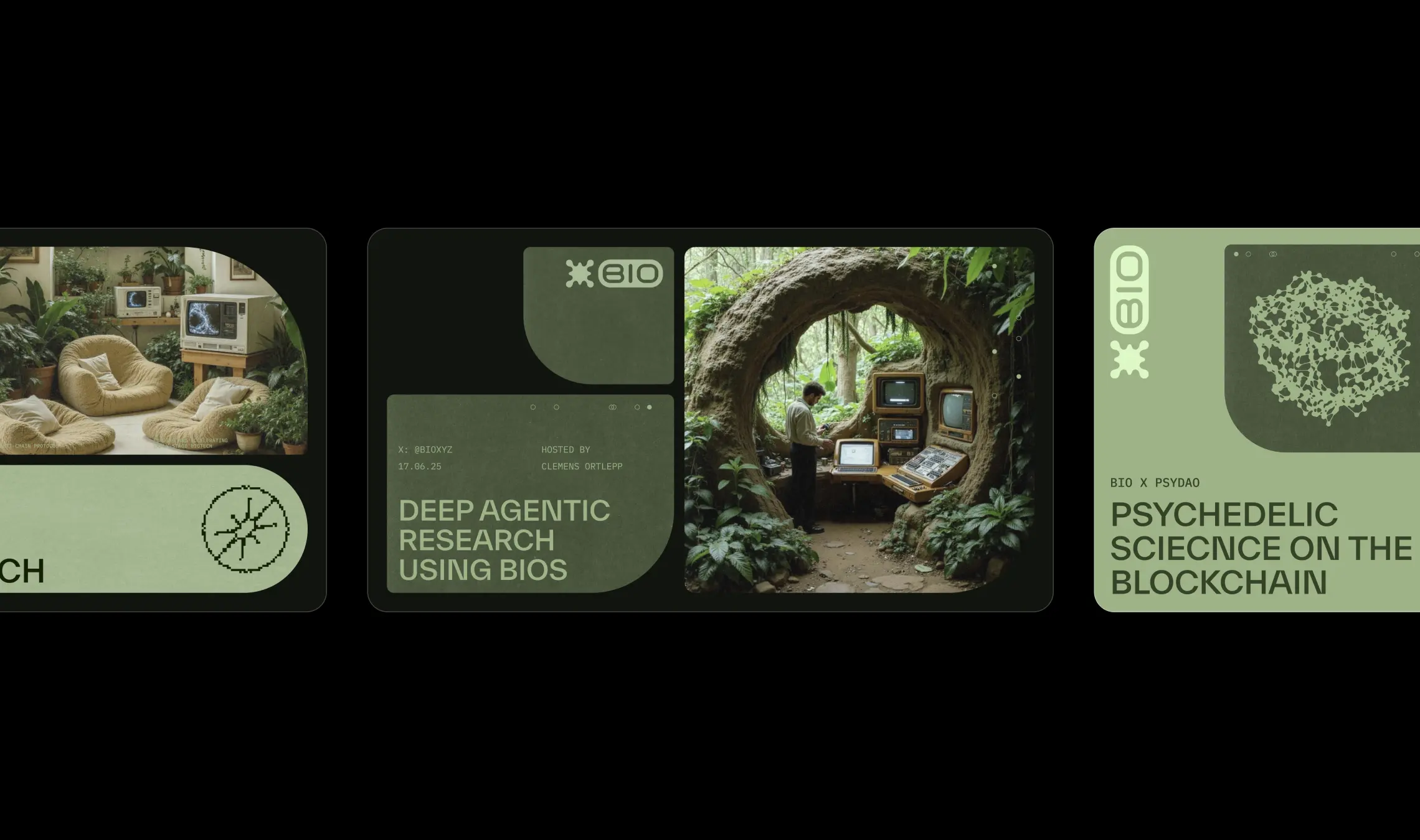
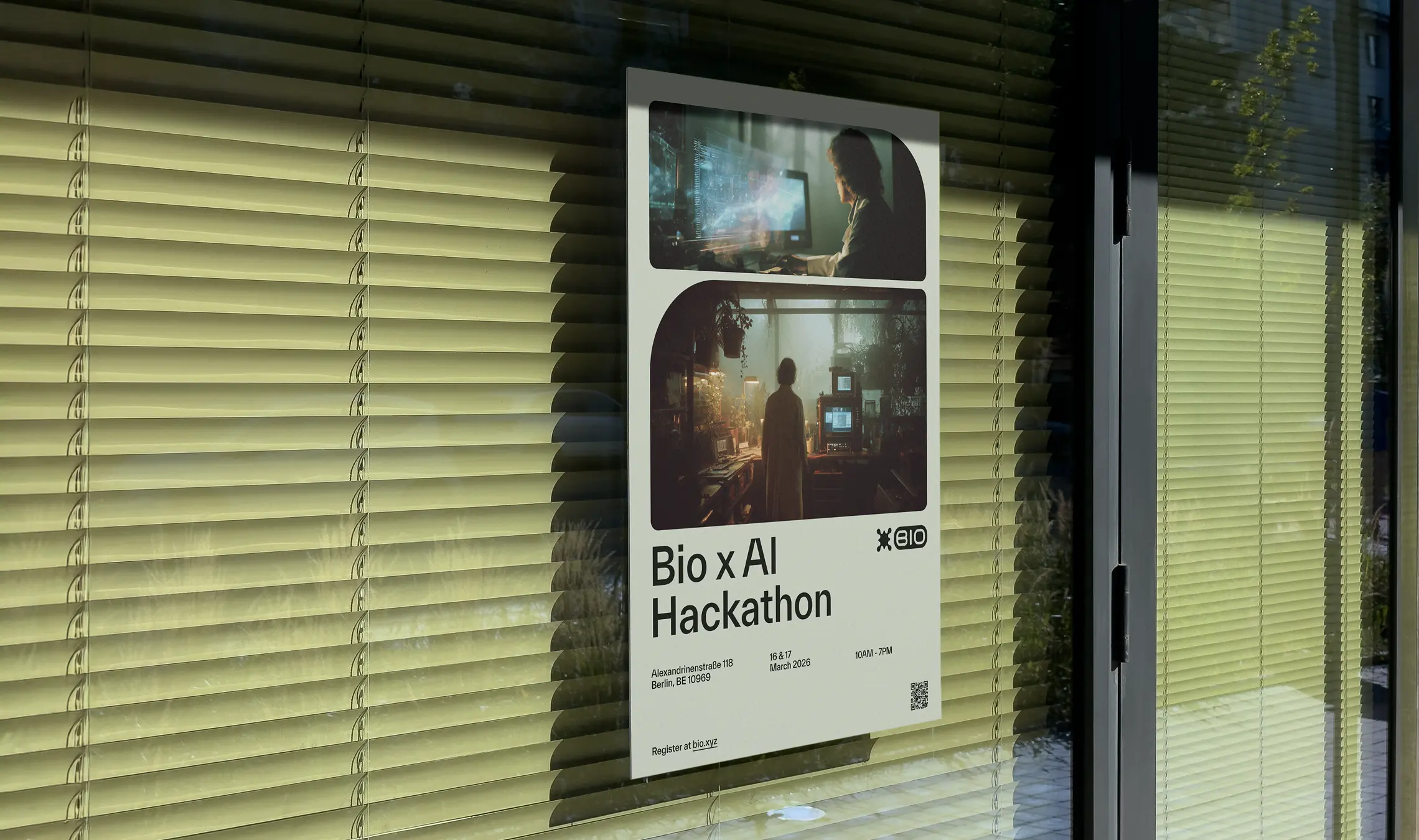
The Bio Brand in Use
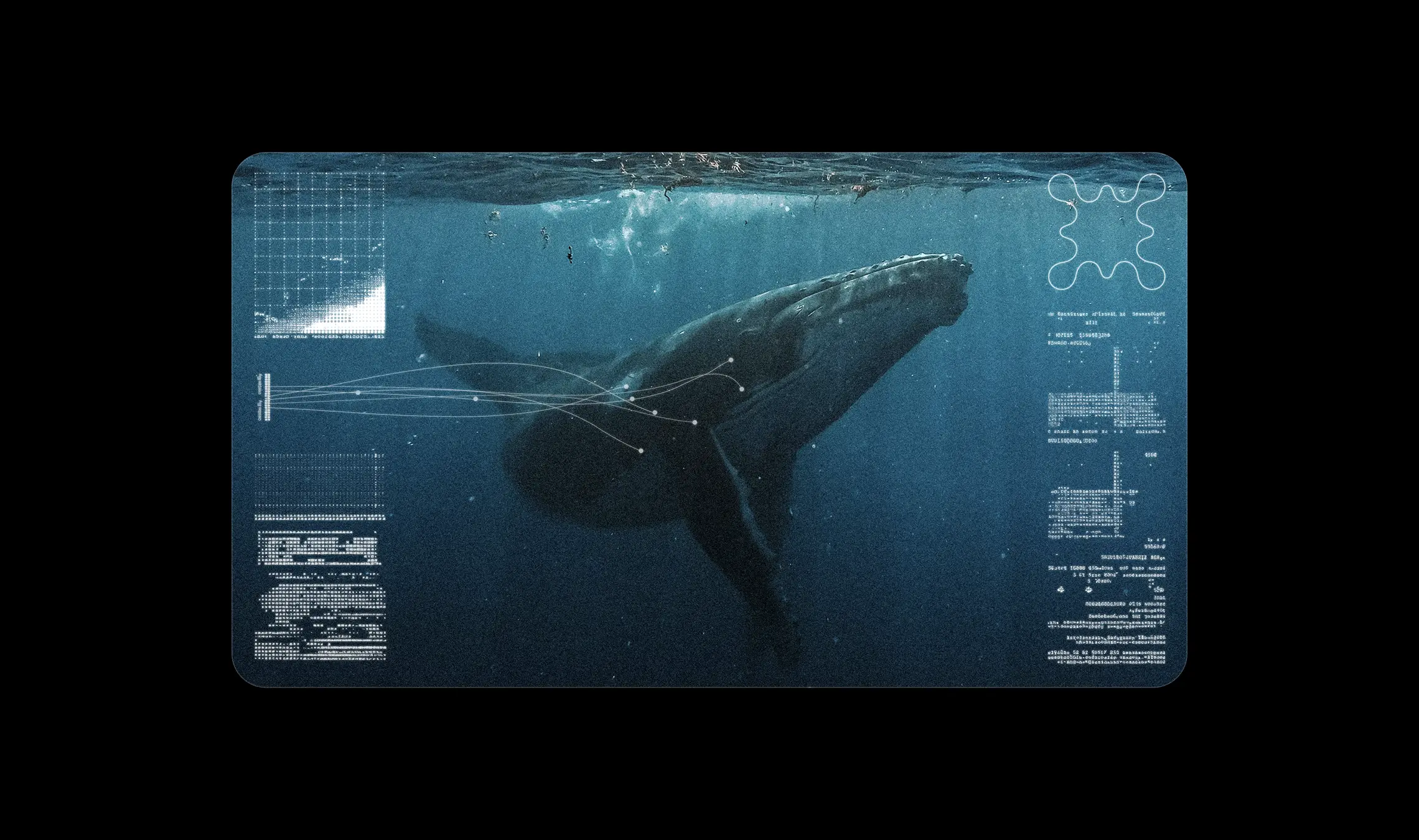
The brand represented here is drawn largely from a single season of BIO’s communications, spanning a wide range of ecosystem touchpoints. The art direction combines retrofuturistic aesthetics with themes of nature, biology, and data — pairing nostalgic computing references with organic textures, scientific imagery, generative systems, and computational visual language. Across the identity, scientists are positioned as the protagonists of the story: the builders, researchers, and experimenters actively shaping the future of biotechnology rather than operating behind the scenes.
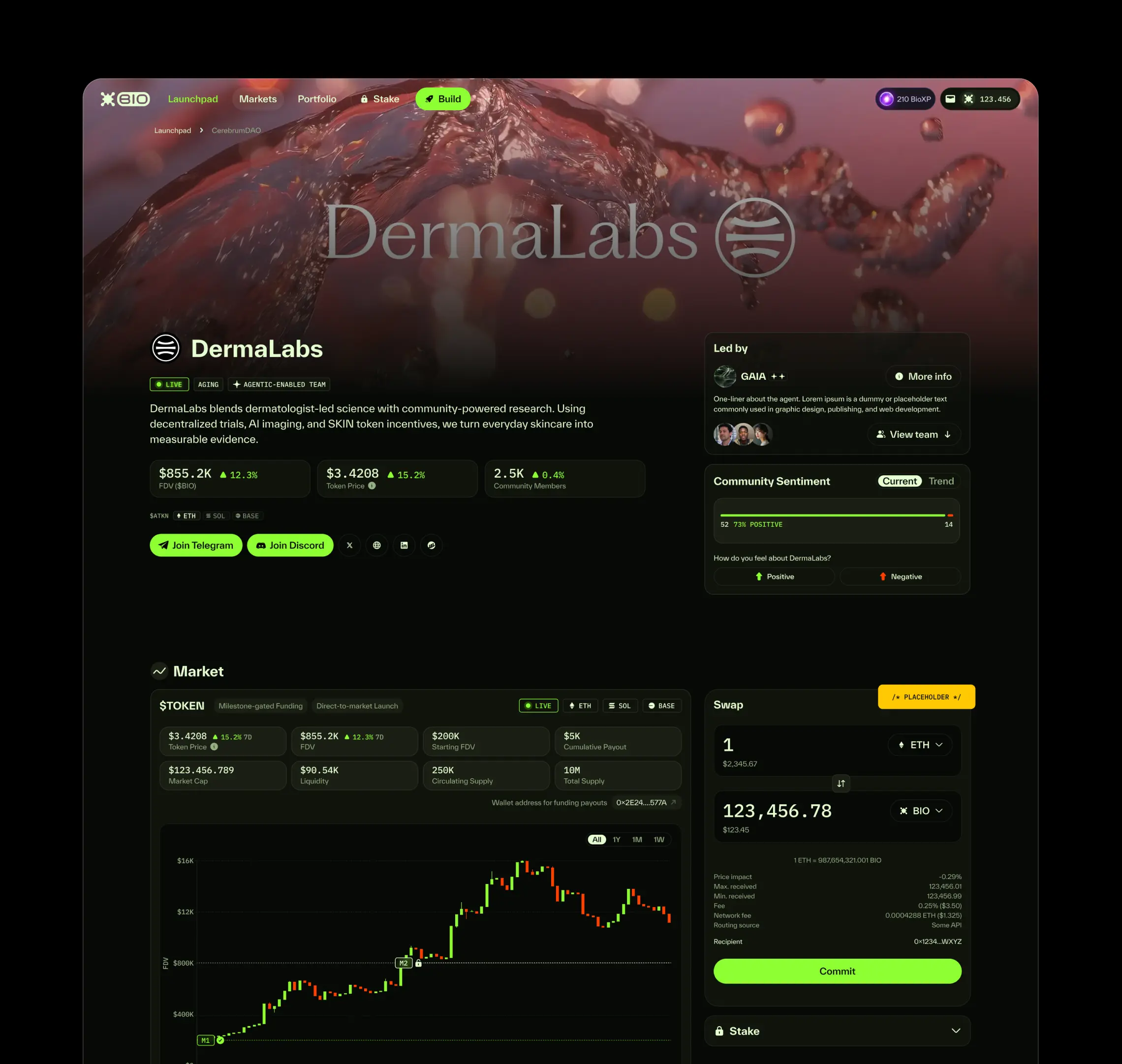
Product UX and design system implementation by Paula Hartel.
“Si injected the perfect balance of approachability, forward-thinking design, and professionalism into our project. We are now using his studio across all of our initiatives – he is an invaluable asset."
